Getting Back To Cartoony Cartoons Part 2
This is the second in a multi-part series on the subject of cartoons and cartoon making. My goal in these articles is to explore writing and making the short format cartoon which can range in length from 1 to 7 minutes. If you missed the first part of this series you can read it here.
One observation that I have made over the years as I watch and study a wide variety of cartoons is that there is for the most part a subtle but noticeable difference between most of what can be termed classic cartoons of the late 1930s to the mid 1950s and today's cartoons. It has to do with the way the cartoon flows. At first I thought it must be something to do with the fact that these classic cartoons were made for viewing in movie theaters while most of today’s cartoons are mostly made for TV. But after researching many of the creators of these classic cartoons and reading many of their writings about how they learned and performed their craft, I found a more basic reason for this difference. It has to do with rhythm. We all know that timing is one of the cornerstones of animation and there are plenty of books and articles that focus on timing of individual actions. But the great directors like Clampett, Avery, Jones, Freleng and McKimson also focused on a different level of timing. They actually planned out the timing of the entire cartoon.
When I first read the book "Chuck Amuck" by Chuck Jones, I sort of glossed over the parts where he talked about meticulously timing cartoons before starting the layouts. I thought he was just referring to making sure the film fit exactly into its 6 minute format. I thought it was a cost control measure imposed on the directors to insure that no wasted footage was created. It seemed logical that the executives at the studios did not want to waste money on work that never would reach the screen. That view was very true, but I really missed the point on my first interpretation of what Chuck was discussing.
He talked about learning from Friz Freleng and others to exactly time their films on bar sheets. They used musical bar sheets. Perhaps my ignorance of music and composition caused me not to see any particular significance to this practice. The classic cartoons were timed to musical tempos. Today's cartoons are just timed straight ahead, action by action. They are random in their rhythm, and they feel jerky. The classical cartoons have rhythm. Just like in music, tempos vary, slow then fast; the rhythms weave in and out of each other and create moods. Classic cartoons flowed from this musical influence. I had a bit of a "well slap my forehead" experience as I realized this observation. It totally must have evolved from the early 1930s when sound cartoons all were basically animation set to music. (The Silly Symphonies, the Merry Melodies, the Looney Tunes etc) To make those kinds of cartoons they had to learn to time the pace and flow of the cartoons to the music. The music came first; it wasn't added after the fact. So that skill of learning to time cartoons to music stayed on as an influence even when the original reason it was done had stopped.
This is a very important observation because it points to one of the unique aspects that make animation potentially very different from live action. Music has the power to sweep its listeners up and to invoke emotions and feelings. And cartoons have this same power, if the film maker is aware of how to compose and arrange his cartoon composition.
A cartoon can be thought of as a composition much the same as a musical composition. Music to be truly expressive needs melody and rhythm. Harmony, syncopation, structure, and movements are all variations and arrangements of the melody and rhythm. Cartoons compositions substitute pictures for melody and use rhythm to regulate the flow of the pictures. Without rhythm and pacing, a cartoon does not deliver its maximum potential. Rhythm and pacing give a cartoon added punch. They help to establish a cohesive experience a more synergistic impact. In planning a cartoon a film maker wants to use tempo, contrasting actions and sequences. These are the tools of pacing. You alternate slow scenes with fast scenes, dialogue scenes with action scenes, and give each sequence its own tempo. You want to create a rhythmic wave to the cartoon. It rises and falls continuously building an over all mood straight through to a climax.
The value of this approach is that everything is focused by a firm framework that is organized and controlled by a holistic vision, a compositional flow. It isn't just a matter of taking a situation and based on the characters interactions and reactions throwing together a string of funny gags. It is a well thought out composition. Can you create cartoons without a compositional approach? Absolutely, but imagine the additional impact your cartoons would have by adding this more powerful approach.
Cartoons should be fun, Fun to make and fun to watch. They shouldn't be realistic, but rather they should be outrageously unrealistic both in their visual appearance and in their content. Things that aren't possible in real life are and should be totally possible in a cartoon. Cartoons are for entertainment and escape from the everyday world. The wilder they are the better. A well written cartoon needs familiar characters that are put into a situation, usually the more absurd the setting the more outrageous the story can be. Then the writer tries to rhythmically construct a composition of ever escalating gags, centered on the situation, climaxing with a final punctuation gag that hopefully has been completely unexpected and yet thematically flows from the prior action. The more absurd the cartoon is the better. Cartoons are supposed to be cartoony. There are no boundaries beyond the common dictates of acceptable taste. The only rule you need to follow is that it must be entertaining for the viewers including but not limited to yourself.
Genndy Tartakovsky's Dexter's Laboratory is a great example of modern cartoon writing and composition. Beginning with his characters, Genndy believes strongly in contrasts. Dee Dee's character is designed as a ballerina; she is tall and slender with long legs. She always acts in a much exaggerated way. She is always striking a pose as if she were pretending to be a ballerina. Dexter is short and squat. Dee Dee is lively and graceful while Dexter is subdued and almost mechanical.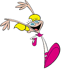
At first glance the coloring style of these cartoons is not very sophisticated. There is very little use of muted or neutral colors. But there is great energy in this style. Genndy uses lots of orange purple yellow blue and pink. This could be very distracting but Genndy sticks to only two or three colors in a scene and the background colors are composed around the action and help to guide the viewer visually. The timing in a Dexter cartoon is really amazing. Genndy not only has great timing of individual actions but the pacing and the rhythm of the entire cartoon is obviously well planned. In Dexter's Lab, Genndy uses beats and contrasted actions and sequences to create his desired audience experience. He alternates slow scenes with fast scenes, dialog scenes with action scenes and each sequence has its own tempo. In the better episodes the rhythm rises and falls building toward the climax. Dexter isn't the e-ticket ride of a Roadrunner, but there is still an emotional connection made beyond the gags. The secret is the pacing and rhythmic flow that creates an emotional experience on top of some laughs.
Genndy likes to insert references to other cartoons or other popular culture in his cartoons. But there is nothing haphazard in these cartoons. From the character design to the backgrounds to the coloring to the music to the dialog to the tempos and pacing everything is focused on telling the story in an entertaining and coordinated fashion. There are equal elements of science and art in a Tartakovsky cartoon. I'm not talking about the context of the story being science, what I talking about is the careful well thought out way in which every element is considered, structured and implemented. Tartakovsky is like a composer, a choreographer, and an orchestra conductor and he is also a brilliant artist and writer.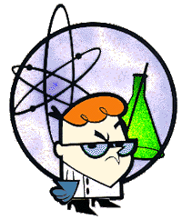
Dexter's Laboratory is from my point of view some of the best work to study for anyone wanting to learn the craft. Certainly the works of Clampett, Freleng, Jones and Avery also are meant to be studied.
A great place to start a discussion of the importance of characters in writing for cartoons is with John Kricfalusi’s characters Ren and Stimpy. I have to confess that I’m a big fan of Kricfalusi’s work. Ren Hoek and Stimpson J. Cat are surely two of the most inventive cartoon characters to come along. And they are certainly worth spending some time and study to understand.
There of course is the basic background behind the characters. Stimpy is a classical simple minded character with an interesting twist. Kricfalusi didn’t want to follow the mold exactly, he wanted to capture the Looney Tunes and Tex Avery style slow witted childlike type of character but not the traditional “Which way did he go George” style of stereotyped voice, so he chose to give Stimpy a parody voice of Larry Fine from the Three Stooges. When you study Kricfalusi’s work you will find that this type of creative choice is very consistent as he is a strong believer in the importance of contrasts. Stimpy is a simple child but he talks with the voice of a grown man. I particularly like the way Kricfalusi characterizes Stimpy when he describes him as someone who thinks he is smart even though he really is “several bricks shy of a full load”. Stimpy is almost totally without the ability to feel pain and he just has this giant nerve ending that responds to being hit and slapped around. If you hit him hard enough and long enough he will eventually respond with great pleasure and love you forever. Ren is also a study in contrasts. He is an Asthma Hound Chihuahua with the voice of the great character actor Peter Lorrie. Ren is very short tempered, incredibly selfish, greedy, and mean. He is cruel to Stimpy and everyone else. Ren is prone to failure, and sometimes crying fits and psychotic outbursts. He uses his friend Stimpy as a patsy who is always there for him. He collects Dinosaur Droppings and Rare Infectious Diseases, and other unusual things. Ren is often jealous of Stimpy's good luck, and usually slaps him silly.
The two characters follow a great tradition of comedy teams like Abbott and Costello or Laurel and Hardy. They are in direct contrast. Ren is angular and wiry looking while Stimpy is pudgy and round. Stimpy is a kind hearted simpleton while Ren is a mean spirited scheming con man. Stimpy is so cute and lovable, but he is oh so stupid. It seems that he ran into a few too many walls when he was a kitten. He likes Muddy Mudskipper and Gritty Kitty Litter. He is roley poly, and drools a lot. He is pretty much a whipping boy for Ren. Stimpy likes to talk to the boogers that he keeps under a table, and he is a charter member of the Loyal Order of Stupids.
Kricfalusi is a real fan of Bob Clampett and Tex Avery so it isn't hard to see that he would pattern one of his main characters after Daffy Duck and the other after Droopy the Dog. But Ren and Stimpy are influenced by these characters and yet unique and original at the same time. The important thing to note about the Ren and Stimpy cartoons is that they are totally character driven. Each episode follows in the Warner Bros. tradition of placing well established characters into situations and just letting their personalities guide the outcome. –End of Part 2-
One observation that I have made over the years as I watch and study a wide variety of cartoons is that there is for the most part a subtle but noticeable difference between most of what can be termed classic cartoons of the late 1930s to the mid 1950s and today's cartoons. It has to do with the way the cartoon flows. At first I thought it must be something to do with the fact that these classic cartoons were made for viewing in movie theaters while most of today’s cartoons are mostly made for TV. But after researching many of the creators of these classic cartoons and reading many of their writings about how they learned and performed their craft, I found a more basic reason for this difference. It has to do with rhythm. We all know that timing is one of the cornerstones of animation and there are plenty of books and articles that focus on timing of individual actions. But the great directors like Clampett, Avery, Jones, Freleng and McKimson also focused on a different level of timing. They actually planned out the timing of the entire cartoon.

When I first read the book "Chuck Amuck" by Chuck Jones, I sort of glossed over the parts where he talked about meticulously timing cartoons before starting the layouts. I thought he was just referring to making sure the film fit exactly into its 6 minute format. I thought it was a cost control measure imposed on the directors to insure that no wasted footage was created. It seemed logical that the executives at the studios did not want to waste money on work that never would reach the screen. That view was very true, but I really missed the point on my first interpretation of what Chuck was discussing.

He talked about learning from Friz Freleng and others to exactly time their films on bar sheets. They used musical bar sheets. Perhaps my ignorance of music and composition caused me not to see any particular significance to this practice. The classic cartoons were timed to musical tempos. Today's cartoons are just timed straight ahead, action by action. They are random in their rhythm, and they feel jerky. The classical cartoons have rhythm. Just like in music, tempos vary, slow then fast; the rhythms weave in and out of each other and create moods. Classic cartoons flowed from this musical influence. I had a bit of a "well slap my forehead" experience as I realized this observation. It totally must have evolved from the early 1930s when sound cartoons all were basically animation set to music. (The Silly Symphonies, the Merry Melodies, the Looney Tunes etc) To make those kinds of cartoons they had to learn to time the pace and flow of the cartoons to the music. The music came first; it wasn't added after the fact. So that skill of learning to time cartoons to music stayed on as an influence even when the original reason it was done had stopped.
This is a very important observation because it points to one of the unique aspects that make animation potentially very different from live action. Music has the power to sweep its listeners up and to invoke emotions and feelings. And cartoons have this same power, if the film maker is aware of how to compose and arrange his cartoon composition.
A cartoon can be thought of as a composition much the same as a musical composition. Music to be truly expressive needs melody and rhythm. Harmony, syncopation, structure, and movements are all variations and arrangements of the melody and rhythm. Cartoons compositions substitute pictures for melody and use rhythm to regulate the flow of the pictures. Without rhythm and pacing, a cartoon does not deliver its maximum potential. Rhythm and pacing give a cartoon added punch. They help to establish a cohesive experience a more synergistic impact. In planning a cartoon a film maker wants to use tempo, contrasting actions and sequences. These are the tools of pacing. You alternate slow scenes with fast scenes, dialogue scenes with action scenes, and give each sequence its own tempo. You want to create a rhythmic wave to the cartoon. It rises and falls continuously building an over all mood straight through to a climax.

The value of this approach is that everything is focused by a firm framework that is organized and controlled by a holistic vision, a compositional flow. It isn't just a matter of taking a situation and based on the characters interactions and reactions throwing together a string of funny gags. It is a well thought out composition. Can you create cartoons without a compositional approach? Absolutely, but imagine the additional impact your cartoons would have by adding this more powerful approach.
Cartoons should be fun, Fun to make and fun to watch. They shouldn't be realistic, but rather they should be outrageously unrealistic both in their visual appearance and in their content. Things that aren't possible in real life are and should be totally possible in a cartoon. Cartoons are for entertainment and escape from the everyday world. The wilder they are the better. A well written cartoon needs familiar characters that are put into a situation, usually the more absurd the setting the more outrageous the story can be. Then the writer tries to rhythmically construct a composition of ever escalating gags, centered on the situation, climaxing with a final punctuation gag that hopefully has been completely unexpected and yet thematically flows from the prior action. The more absurd the cartoon is the better. Cartoons are supposed to be cartoony. There are no boundaries beyond the common dictates of acceptable taste. The only rule you need to follow is that it must be entertaining for the viewers including but not limited to yourself.
Genndy Tartakovsky's Dexter's Laboratory is a great example of modern cartoon writing and composition. Beginning with his characters, Genndy believes strongly in contrasts. Dee Dee's character is designed as a ballerina; she is tall and slender with long legs. She always acts in a much exaggerated way. She is always striking a pose as if she were pretending to be a ballerina. Dexter is short and squat. Dee Dee is lively and graceful while Dexter is subdued and almost mechanical.

At first glance the coloring style of these cartoons is not very sophisticated. There is very little use of muted or neutral colors. But there is great energy in this style. Genndy uses lots of orange purple yellow blue and pink. This could be very distracting but Genndy sticks to only two or three colors in a scene and the background colors are composed around the action and help to guide the viewer visually. The timing in a Dexter cartoon is really amazing. Genndy not only has great timing of individual actions but the pacing and the rhythm of the entire cartoon is obviously well planned. In Dexter's Lab, Genndy uses beats and contrasted actions and sequences to create his desired audience experience. He alternates slow scenes with fast scenes, dialog scenes with action scenes and each sequence has its own tempo. In the better episodes the rhythm rises and falls building toward the climax. Dexter isn't the e-ticket ride of a Roadrunner, but there is still an emotional connection made beyond the gags. The secret is the pacing and rhythmic flow that creates an emotional experience on top of some laughs.
Genndy likes to insert references to other cartoons or other popular culture in his cartoons. But there is nothing haphazard in these cartoons. From the character design to the backgrounds to the coloring to the music to the dialog to the tempos and pacing everything is focused on telling the story in an entertaining and coordinated fashion. There are equal elements of science and art in a Tartakovsky cartoon. I'm not talking about the context of the story being science, what I talking about is the careful well thought out way in which every element is considered, structured and implemented. Tartakovsky is like a composer, a choreographer, and an orchestra conductor and he is also a brilliant artist and writer.

Dexter's Laboratory is from my point of view some of the best work to study for anyone wanting to learn the craft. Certainly the works of Clampett, Freleng, Jones and Avery also are meant to be studied.
A great place to start a discussion of the importance of characters in writing for cartoons is with John Kricfalusi’s characters Ren and Stimpy. I have to confess that I’m a big fan of Kricfalusi’s work. Ren Hoek and Stimpson J. Cat are surely two of the most inventive cartoon characters to come along. And they are certainly worth spending some time and study to understand.
There of course is the basic background behind the characters. Stimpy is a classical simple minded character with an interesting twist. Kricfalusi didn’t want to follow the mold exactly, he wanted to capture the Looney Tunes and Tex Avery style slow witted childlike type of character but not the traditional “Which way did he go George” style of stereotyped voice, so he chose to give Stimpy a parody voice of Larry Fine from the Three Stooges. When you study Kricfalusi’s work you will find that this type of creative choice is very consistent as he is a strong believer in the importance of contrasts. Stimpy is a simple child but he talks with the voice of a grown man. I particularly like the way Kricfalusi characterizes Stimpy when he describes him as someone who thinks he is smart even though he really is “several bricks shy of a full load”. Stimpy is almost totally without the ability to feel pain and he just has this giant nerve ending that responds to being hit and slapped around. If you hit him hard enough and long enough he will eventually respond with great pleasure and love you forever. Ren is also a study in contrasts. He is an Asthma Hound Chihuahua with the voice of the great character actor Peter Lorrie. Ren is very short tempered, incredibly selfish, greedy, and mean. He is cruel to Stimpy and everyone else. Ren is prone to failure, and sometimes crying fits and psychotic outbursts. He uses his friend Stimpy as a patsy who is always there for him. He collects Dinosaur Droppings and Rare Infectious Diseases, and other unusual things. Ren is often jealous of Stimpy's good luck, and usually slaps him silly.

The two characters follow a great tradition of comedy teams like Abbott and Costello or Laurel and Hardy. They are in direct contrast. Ren is angular and wiry looking while Stimpy is pudgy and round. Stimpy is a kind hearted simpleton while Ren is a mean spirited scheming con man. Stimpy is so cute and lovable, but he is oh so stupid. It seems that he ran into a few too many walls when he was a kitten. He likes Muddy Mudskipper and Gritty Kitty Litter. He is roley poly, and drools a lot. He is pretty much a whipping boy for Ren. Stimpy likes to talk to the boogers that he keeps under a table, and he is a charter member of the Loyal Order of Stupids.

Kricfalusi is a real fan of Bob Clampett and Tex Avery so it isn't hard to see that he would pattern one of his main characters after Daffy Duck and the other after Droopy the Dog. But Ren and Stimpy are influenced by these characters and yet unique and original at the same time. The important thing to note about the Ren and Stimpy cartoons is that they are totally character driven. Each episode follows in the Warner Bros. tradition of placing well established characters into situations and just letting their personalities guide the outcome. –End of Part 2-

2 Comments:
you are a brilliant person, when will part 3 be out?
Soon I think, I'm glad you found this interesting.
Post a Comment
<< Home