The Less Limited Expressive Possibilities of Limited Animation – Part 1
In the 1950’s and 1960’s, what has been labeled as “limited” animation, a logical evolution in technique, signified a major transformation in the established aesthetics of the art form. During the animation industry developmental years of 1930’s and 1940’s, the pioneers at the Disney Studios evolved a highly naturalistic aesthetic, striving to make their drawings look as real as possible within the limitations of hand drawn art. The feature film Snow White is perhaps one of the best examples of how the Disney artists established their vision for the future of animation. Then, inspired by late 1940’s art movements such as abstract expressionism which rejected this naturalistic approach, avant-garde principles began to filter down into cartoons. In particular, United Productions of America (UPA), a studio that employed many animators who had left Disney during the 1941 animation industry labor strike, championed an aesthetic that emphasized abstract line, shape, and pattern over the more naturalistic style. In many respects they were expressing a logical desire to differentiate their art form of animation from the more general art form of cinema.

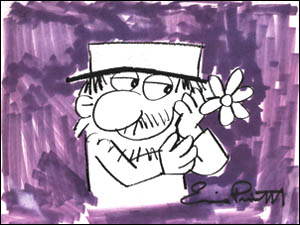
Flebus by Ernie Pintoff.
The UPA style was characterized by flattened perspective, abstract backgrounds, strong primary colors, and what has become labeled as "limited" animation. Instead of using perspective to create the illusion of depth in their drawings, the UPA style cartoons looked flat, like blobs of shape and color. Instead of naturalistic highly detailed backgrounds, these new cartoons presented backgrounds that contained strokes of color, with small squiggles that were just abstract representations of real objects. Instead of varying the shades and hues to imply the colors of the natural world, UPA's cartoons contained bold, bright, saturated colors that popped. Just as in the world of painting where realism had been replaced by impressionist abstraction, so had an evolution of style come to animation.
Most importantly for the future development of cartooning, UPA used animation that was “limited” in three ways. First, the amount of movement within each frame was substantially reduced. Rather than have a cartoon character move their entire body in a shot, they would only move a single body part like their mouth or their eyes while most of the drawings where held unchanged. Second, in limited animation, character movements are often repeated which is referred to as a cycle. A character action, for instance, might contain only a few distinct movements which are then repeated without change. Full animation, in contrast, includes many unique movements and avoids any hint of repetition. Third, limited animation uses fewer individual drawings to represent a movement. In a more traditional style cartoon, Bugs Bunny interacting with Daffy Duck might gesture expressively in an action that when fully animated might use hundreds of discrete drawings to create that movement. Limited animation, in contrast, would create a more abbreviated representation of that gesturing by using a small fraction of that number of drawings. The result is obviously less fluid but can be equally expressive.
The UPA style of changes in animation was aesthetically inspired, but it also could be viewed as good economic sense. Flattened perspective, abstract backgrounds, strong primary colors, and limited animation resulted in cartoons that were easier, quicker and cheaper to make. The 1950’s and 1960’s saw financial pressures on the animation industry that caused other studios to quickly adopt these economical practices, but their new interpretations abandoned many of UPA's abstract expressionism inspired aesthetics. Much of the reason for this shift can be attributed to the disdain that many animation creators had for the tightened production costs that were being imposed. Faster, easier and cheaper in an already under paid and under appreciated art form created significant resentment and much of what followed in the 1960’s to the 1980’s reflects a “just going through the motions to make a pay check” perspective of watered down art. It is interesting how the attitudes of the times get reflected in the quality of the work produced and how all of that disdain translated to a style of animation production which in its origin was meant to be a more expressive evolution of the art form.
In Part 2, I will begin to strip away the layers of disdain and see if we can rediscover the more expressive nature of this style.

1 Comments:
I've just been reading up on UPA and have come across your site - just want to say thanks for an informative and quite considered summary - particulary the references you made to the Abstract Impressionist influences. This suggests to me an interesting link I could explore if I want to learn more about the style and artistic intent behind this studio's work.
Marian Kelly, illustrator
Sydney, Australia
emkay@dwf.homeip.net
Post a Comment
<< Home