Inside Sequential Comic Strips - Part 1
The classical newspaper comic strip is a form of sequential art. This particular cartooning form has undergone some changes over the years and some historical perspective can be quite revealing. It is interesting how things follow a cause and effect relationship, and even more interesting how policies can be implemented that create constraints that continue to exist even though the reason the policy was instituted has vanished. For newspaper comic strips this seems to be the case. Over time beginning in the late 70’s, newspapers began to reduce the space available for comic strips. They slowly began to squeeze the comics into an increasingly smaller amount of space. The first step was to cut the daily comic’s section from two pages down to one and a half pages and then down to a single page. This had the effect of killing off many good comic strips by reducing the number of strips that a paper would continue to publish. Shortly there after, the individual “footprint”, available space on the page, of each remaining strip got the big squeeze and four panel strips pretty much were forced down to three panels. Additionally this print size reduction made it increasingly difficult for the cartoonists to maintain their desired level of visual detail in their work.
This policy shift toward marginalizing comic strips in newspapers caused two resulting effects. First, it greatly tightened the field of opportunity for cartoonists to draw comic strips, less space meant papers bought fewer strips so drawing a comic strip became less accessible as a career. Second, smaller “footprints” forced cartoonists to move toward simpler more graphically stylized cartoons with minimal layouts. There was less white space, so there had to be less visual information in each panel. The age of the “clip art” comic strip was born.
Then along came the Internet and a whole new distribution medium for the sequential comic strip was born. This made self publishing possible and created new opportunities for cartoonist to return to drawing comic strips. But as many of these new breed web cartoonists were born after 1980, they had grown up in the post “clip art” comic strip era. They had little knowledge of the art form before the “big squeeze”. So as they approached drawing comic strips they continued to work under the policies of the newspapers even though the Internet held none of those restrictions. They were constrained by policies that had no reason to exist in their new world. The numbers of panels per day, the size of the space for the artwork, all were no longer restricted by some arbitrary publisher and yet these constraints were translated to the web. The new cartoonist didn’t realize they were blindly following policies that had no basis. In many cases this trend still continues. The Internet offers tremendous creative freedom and opportunity for the sequential comic strip, and a chance to explore new visual styles and formats. As I said in the beginning, it is interesting how things follow a cause and effect relationship, and even more interesting how policies can be implemented that create constraints that continue to exist even though the reason the policy was instituted has vanished.
In this and future articles I will be discussing my own work in developing a comic strip for viewing on the internet. So to begin, I want to re-introduce some often lost aspects of comic strips based on my own personal study of one of my most influential cartoonist heroes, Walt Kelly.

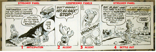
(click on the fig.1 above to see a larger version)
If you ask most fans of Pogo, Walt Kelly's famous comic strip, they will probably tell you about his great political and social satire, his amazingly detailed backgrounds or his great characters or his superb visuals. But in this article I want to point out his layout and mastery of visual story telling. In fig1. above, Kelly is using a four panel format. Notice that the panels are not the same size. This is not arbitrary or accidental. Panel sizing is an important tool for the sequential story teller. The relative order and size of the panels is to a sequential comic what pacing and timing are to an animated cartoon sequence. In fig.1 Kelly starts with two even sized panels to give the story a balanced beginning. Then he inserts an accent in the form of a compressed panel. Wider panels slow the reader down, narrower panels speed them up or sharpen their focus. The last panel is wider and acts as a resting point to allow the gag and or the message of the strip, in Kelly's case, to settle in.

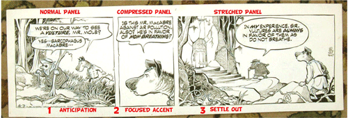
(click on fig.2 above to see a larger version)
In fig2. above we get a different example of Kelly's layout skills. Walt Kelly was a master of generating tremendous visual energy in a tiny strip. The first panel is stretched out and designed to create a sense of visual anticipation. It's an antic for the pending action. Then all hell breaks loose as he fires two compressed panels at us back to back. Then another stretched out panel to settle us down as the action tails off in the distance. Great graphics amazing visualization and most importantly enhanced story telling through his layouts.

(click on fig.3 above to see a larger version)
Finally, in fig3. above we once more get to see the master story teller at his best. Panel size and arrangement is used to focus the reader and move them visually to the climax. It's a comic strip and a story board at its best. The strip cartoonist is a story teller and a cinematographer and a humorist rolled into one.
As you can see from these examples, before the big squeeze in the newspapers, the comic strip was very different than today's print examples. That is sad in many respects, but the joy and beauty of comics delivered over the Internet is that all those constraining policies that have driven newspaper comic strips to be "clip art" shadows of there former selves no longer apply. The restrictions and constraints are totally controlled by the web cartoonist. These are very exciting and liberating times for the future Walt Kellys of the web.
This policy shift toward marginalizing comic strips in newspapers caused two resulting effects. First, it greatly tightened the field of opportunity for cartoonists to draw comic strips, less space meant papers bought fewer strips so drawing a comic strip became less accessible as a career. Second, smaller “footprints” forced cartoonists to move toward simpler more graphically stylized cartoons with minimal layouts. There was less white space, so there had to be less visual information in each panel. The age of the “clip art” comic strip was born.
Then along came the Internet and a whole new distribution medium for the sequential comic strip was born. This made self publishing possible and created new opportunities for cartoonist to return to drawing comic strips. But as many of these new breed web cartoonists were born after 1980, they had grown up in the post “clip art” comic strip era. They had little knowledge of the art form before the “big squeeze”. So as they approached drawing comic strips they continued to work under the policies of the newspapers even though the Internet held none of those restrictions. They were constrained by policies that had no reason to exist in their new world. The numbers of panels per day, the size of the space for the artwork, all were no longer restricted by some arbitrary publisher and yet these constraints were translated to the web. The new cartoonist didn’t realize they were blindly following policies that had no basis. In many cases this trend still continues. The Internet offers tremendous creative freedom and opportunity for the sequential comic strip, and a chance to explore new visual styles and formats. As I said in the beginning, it is interesting how things follow a cause and effect relationship, and even more interesting how policies can be implemented that create constraints that continue to exist even though the reason the policy was instituted has vanished.
In this and future articles I will be discussing my own work in developing a comic strip for viewing on the internet. So to begin, I want to re-introduce some often lost aspects of comic strips based on my own personal study of one of my most influential cartoonist heroes, Walt Kelly.

(click on the fig.1 above to see a larger version)
If you ask most fans of Pogo, Walt Kelly's famous comic strip, they will probably tell you about his great political and social satire, his amazingly detailed backgrounds or his great characters or his superb visuals. But in this article I want to point out his layout and mastery of visual story telling. In fig1. above, Kelly is using a four panel format. Notice that the panels are not the same size. This is not arbitrary or accidental. Panel sizing is an important tool for the sequential story teller. The relative order and size of the panels is to a sequential comic what pacing and timing are to an animated cartoon sequence. In fig.1 Kelly starts with two even sized panels to give the story a balanced beginning. Then he inserts an accent in the form of a compressed panel. Wider panels slow the reader down, narrower panels speed them up or sharpen their focus. The last panel is wider and acts as a resting point to allow the gag and or the message of the strip, in Kelly's case, to settle in.

(click on fig.2 above to see a larger version)
In fig2. above we get a different example of Kelly's layout skills. Walt Kelly was a master of generating tremendous visual energy in a tiny strip. The first panel is stretched out and designed to create a sense of visual anticipation. It's an antic for the pending action. Then all hell breaks loose as he fires two compressed panels at us back to back. Then another stretched out panel to settle us down as the action tails off in the distance. Great graphics amazing visualization and most importantly enhanced story telling through his layouts.

(click on fig.3 above to see a larger version)
Finally, in fig3. above we once more get to see the master story teller at his best. Panel size and arrangement is used to focus the reader and move them visually to the climax. It's a comic strip and a story board at its best. The strip cartoonist is a story teller and a cinematographer and a humorist rolled into one.
As you can see from these examples, before the big squeeze in the newspapers, the comic strip was very different than today's print examples. That is sad in many respects, but the joy and beauty of comics delivered over the Internet is that all those constraining policies that have driven newspaper comic strips to be "clip art" shadows of there former selves no longer apply. The restrictions and constraints are totally controlled by the web cartoonist. These are very exciting and liberating times for the future Walt Kellys of the web.
Labels: Cartooning, Sequential Comic Strips

1 Comments:
Interesting analysis Jerry. As a story board artist I usually ask myself when laying out a scene what does the audience need to see, when's the best time to reveal it and how can I make it clear and still try to make it dynamic. And by dynamic I mean communicate the message with the most power. I imagine I try to use those rules of thumb in my comic strip as well but strips have constraints. You must edit and pace the dialog (not easy) along with the drawing in the panel and vice versa. One effects the other as they exist in conjunction with each other unless you have a sequential strip made up of images alone. Sometimes that affects whether or not your panel is, as you put it, normal, compressed or stretched.
What I found also intrigiung in your article was you mentioning the fact that the web can open up possibilities for comic strips to go. Schulz, redefined the comic strip when he put WW1 goggles on Snoopy and turned the doghouse into a Sopwith Camel not to mention kids with adult like anxieties. Kelly showed us his command of the english language and an animators talent. In Mad magazine Don Martin took sound effects to an absurd height.
All effected content and served it well.
Maybe someone will come along and create a new language in this medium that will not only explore but reveal the comedic truth's in the content but also in the form. Maybe it's interactive or 3-D or partially animated (Like Larry Levine is doing). Or maybe someone's doing it already, I don't know, but it be interesting to see something that helps keep the craft of cartooning flourishing.
Well, there's my daily dose of BS.
Best Regards,
Bill
Post a Comment
<< Home