***** Please Don't Forget To Visit These Web Comics *****

BugPudding Webcomic Adventures of Lewis and Cluck Webcomic

Additionally, You Can Help Support Cartooning in ToonBoom By Making A $5 donation.

Friday, January 11, 2008

Perspectives and Counters

Library templates are very useful for saving your animation assets for future re-use. But here are a couple of useful examples of other ways to use your library templates as aids in doing your animation work.

The first template is a frames counter. I can't keep track of how many times I would have wanted to have the current frame number displayed while I was watching a playback test. The playback viewer has a time code counter but I often see a problem and want to isolate the frame or frames where that problem exists. It also is useful in isolating sound to action sync problems. So I created a "counter" template. Now it isn't a sophisticated device, but rather a sequence of cells in an element where each cell is numbered to match the frame it occupies. For my purposes I found that 300 was a good number of frames that more often than not fit any sequence I wanted to test. Now it took a little time to create and number 300 cells but it's a one time task and you save it as a global library template and then your counter is available for any future project use. You will see it in action in a minute.

Another area in which I always find myself wanting some help is with my drawing perspective. I use to just make some guide marks in a scratch element. Then I decided that I was doing this quite frequently and so I started making and saving perspective grids as global library templates. Now whenever I need a perspective reference I can just pull out the template and put it in a reference element in any project.
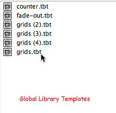


Below are some samples of templates I use for perspective references in my drawing.
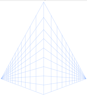

This template is a two point perspective reference with a below center horizon line which is great for a viewpoint looking up from ground level or "worm's eye" view.
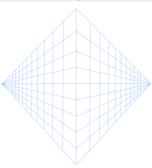


This perspective grid template has the horizon line above the middle and is useful for a more elevated view reference.
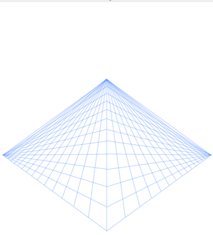

This is a three point perspective grid template.
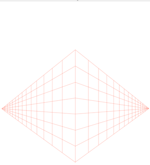

This perspective template is a neutral or eye level two point grid and I use this one quite often as you will see in the animation work below.
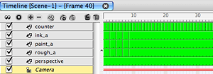


This is the timeline I'm using for this example project. I've created an element named "counter" for my frames counter template and placed it above the other elements to superimpose the frame count. If I don't want this frame count to be included in the final render all I need to do is un-check its timeline track label. I also have an element included named "perspective" which I'm using for my two point eye level perspective grid template. It is one cell with its exposure extended for the desired time I want the reference visible. Again when I don't want this included in the render I just un-check the perspective element's timeline track label. I put it at the bottom of the list so it is behind my drawings. I normally work on sketching in drawing view with the field guide grid turned off when I'm using a perspective grid because it makes things less cluttered. I can always toggle the field guide on and off if I need to check a field size.
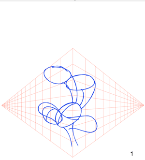


I'm working here in drawing view with the field grid toggled "off " and the auto-light table turned "on" so that my perspective grid is visible below where I am sketching. It really makes it easier to draw solid and maintain proper perspective with this visual aid. The color of the perspective grid is a personal choice and is easy to change. Notice that the frame number is also visible. That's a nice bonus when using the counter template.
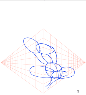

I'm doing a "take" where the character's head is turning so having a perspective reference is really a must.
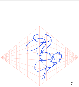

I'm just roughing in the basic forms and using the grid as my 3D reference.
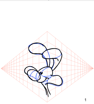


After I finish roughing out all the cells for this action I can begin to clean up using my ink color.
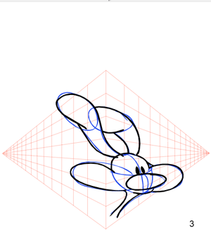
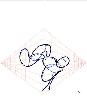
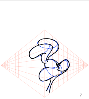
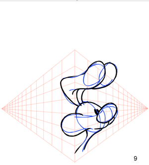


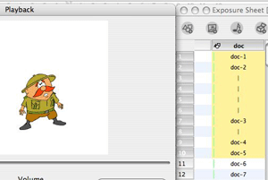
Below is a 72 frame test render of the "take" action I just completed. I rendered the test with the perspective grid and the frames counter. And you can see that they are both useful aids in making this animation. I can stop the playback at anytime and isolate the frame or frames where I don't like the action. And I can single frame through the playback and know exactly where I am in the sequence down to the frame. Time codes are nice but I also like to see frame numbers on my tests. A couple of creative aids made easy to re-use and apply with global library templates. I hope this inspires you to create your own as well as possibly some other animation aids that you find useful.

Labels: , , ,

Wednesday, May 9, 2007

Some Additional TBS User Tips

Adding Contrast to Your Drawing View

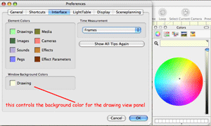
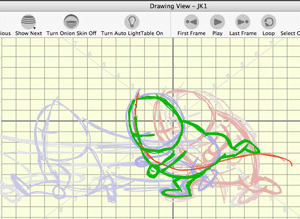
This is a simple tip that can improve your use of the Onion Skinning feature in drawing view. You probably already are familiar with Onion Skinning but if not, be sure to read one of my previous tutorial articles A Good Place to Start Part 1. One of the nice features of Onion Skinning in Toon Boom Studio is that you can customize the color for displaying the “previous” drawings as well as the “next” drawings. For example you could set “previous” to a color like red and “next” to a color like blue. (The color choice is a personal preference with the desired result being a strong contrast.) To customize your Onion Skinning you need to go to Preferences and select the Light Table tab. Additionally you can use View>Onion Skin>Show Outline on Onion Skin as a contrast aid if your drawing objects are already paint filled. But sometimes even with all of those aids you still might like some additional visual contrast to help you see multiple levels in your drawing stack more clearly. Believe it or not you don’t have to draw on a pure white digital paper. You can customize the drawing view background to make it easier on your eyes and to add contrast to Onion Skinning too. To do this you want go to Preferences and select the Interface tab. There you will find a custom color choice for the drawing view panel. Pick what ever color helps you work more productively. I often use a pale cream color because it produces less of a glare and improves visual contract in Onion Skinning.


This tab also provides you a way to customize your element tracks to make them easier to identify in your Timeline panel.


Take Advantage of Colors as a Rough Drawing Aid

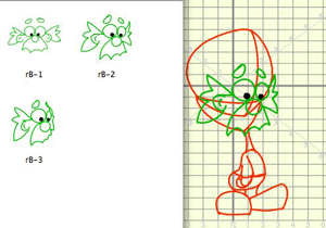
This is one of those tricks in animating that is so often not used, perhaps because it has to do with roughing out your animations and not finished work. I showed some basics of using forms in the construction of a character in a previous article Jumping into Animation Part 1. Much like the use of color for contrast can make it easier to work with Onion Skinning; contrasting colors are a great aid to roughing in a character. Not only does it help to use multiple scratch pad elements, but it is also useful to use different colors for each layer of your rough construction. Think about it like using several contrasting colored pencils for your rough sketching. I have a special color pallet that I created just for doing rough sketching which I import into every project. A great way to use Toon Boom Studio's color management system, which links color pallet swatches to their lines and fills, is to adjust the alpha or opacity setting of a color swatch used on a lower drawing layer when you want that color to be less visible. I crank my sketch pallet colors' opacity levels up and down often during rough construction. So I not only have the advantage of different colors for contrast, I also can adjust the visual brightness of a color too. It is like having a dimmer feature for the Auto Light table.

Here is an example of using colors and forms to construct a head turn.

Labels: , ,

More TBS User Tips and Tricks

Sequential Numbering of Drawings in an Element

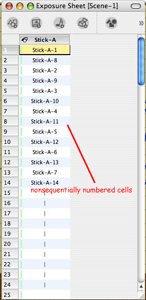
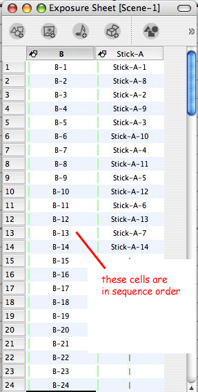
When I am doing an animation sequence, I like to have all my drawings sequentially numbered. There are many reasons that this is a useful practice. Besides being visually easier there is also the fact that if you use the cell swapping feature of the Properties panel you know that it presents your cells in sequential numerical order. Also if you use the advanced cycle building function you need to have your cycle organized in sequential cell order for it to work properly. Now one of the problems that I have with TBS is that if I am drawing the animation directly into TBS and I don’t know exactly how many drawings or inbetween drawings I will need, then just letting TBS automatically number the drawings as I make them will cause my cells to be numbered in the actual order of creation which is non-linear as opposed to sequentially numbering them.


When I animate I typically work from a series of key pose drawings and then, as I refine the timing, I go back and fill in the appropriate breakdown drawings and in between drawings. This is an iterative process and highly non-sequential. So as an example my exposure sheet column for an element “A” might end up looking something like:

A-1, A-10, A-6, A-11, A-2, A-12, A-7, A-13, A-3, A-14, A-8, A-15, A-4, A-9, A-16, A-5.

Ideally I would prefer it to look like:

A-1, A-2, A-3, A-4, A-5, A-6, A-7, A-8, A-9, A-10, A-11, A-12, A-13, A-14, A-15, and A-16.

Now technically the numbering isn’t critical because the location of the cells in the exposure sheet controls their position in the viewing of the frame sequence, but organizationally, for me as the animator, I find it easier to work with my drawings in the exposure sheet when they are numbered sequentially like I would number them if I were doing this as hand drawn animation on paper.

So here is a tip from my personal work flow style which resolves this issue, at least to suit my personal way of working.

When I create a new drawing element, for example element “A”, I make an educated guess as to the maximum number of cells I will need for this element for this scene. So again, for this example, I decide I might need as many as 100 drawings.

My first step is to go to the first cell position of the element A's column and “right click” and select Insert Cell.. from the context menu. In the number box, I enter 100 making sure that Named CellsBefore is selected and click on OK. This causes the element to be populated with 100 cells sequentially numbered from 1 to 100. An alternate way to do the same thing would be to highlight a range of cells ( I.E. frames 1 to 100) and
“right click” and select Insert Cell.. from the context menu which will then populate all the highlights frames with sequentially numbered blank cells.


Next, I select the first cell in the range and holding the shift key down, I select the rest of the 100 cell range of cells and right click and select Delete Cell from the context menu. You might be wondering why I just deleted the cells I just created but they aren’t really deleted they just no longer show in the exposure sheet.

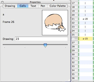
Now as I animate, I can select the desired numbered cell I want for a drawing by using the Cell tab in the Properties panel. This gives me complete control of my sequential numbering and even if I choose to work on 2’s for example (that's two exposures for each cell) I can just use the odd numbered drawings and save the even numbers for 1’s when I need to have them. For example:

A-1, A-3, A-5, A-7, A-9, A-11, A-13, A-15, A-17, A-19 …

I like having the visual confirmation of cell numbers matching frame numbers. And if you don't want to go through the delete and add back steps, you can just leave the blank sequentially numbered cells in place and use them or replace them with extra exposures of a previous cell as desired.

Any unused numbers aren’t a problem as they aren’t included in the published animation. For traditionally trained animators like me, this is a nice way to keep things familiar and well organized.

Using Elements Notes and Cell Notes

There is never enough desktop space in TBS when you are working, even if you are lucky enough to have a duel display setup. So there is always a need to use some useful work flow tricks to save space and still have good work organization. One such trick is in naming elements and then utilizing element notes and cell notes for more detailed information.

When I use to do mostly hand drawn animation on paper, I always found ways to abbreviate things and also to write little notes in the margins of my drawings or exposure sheets. So for me, some of those methods just naturally carried over into my TBS work flow. I normally name my elements by single letters of the alphabet. (A, B, C, D,E,F,G …..) and my backgrounds BG with a number, like BG1,BG2. If I later need to add an additional element in between two existing elements, I just add a number to the element name, like A1. This use of alphabet letters just helps me to be more organized and it also makes finding things in a large time line label list really easy.

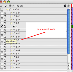
Of course, the major drawback to using a single letter for a name is that it doesn’t tell me what the element contains. So to solve that, I add an element note to each element when I create it. I can put as much detail about the element in that note as I need. The note doesn’t clutter up my screen space, but it is there for me to refer to just by “rolling” over the element’s name label in the timeline or the exposure sheet. So if element “B” is “crazy rabbit character”, I will put that in my element note for element “B”.


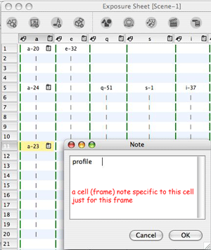
Now cell notes are also very useful when working. I use them whenever I want to remind myself of some action or detail that I want to add to a drawing at a later time. I tend to animate in an iterative multi-pass approach, which means I may revisit a drawing many times before it is completed. So I use an attached cell note to keep up with things left to be done or to be considered. For example “add additional action with crazy rabbit’s ears starting at this drawing”.


The beauty of cell notes is that they are frame specific, which means that when I tie a note to cell a-23 at frame 11 that note is only seen at that location. If I reuse cell a-23 at a different frame location it doesn't include the previously attached note. Element notes are always attached to the element and show both in the Timeline panel track list and in the Exposure Sheet panel.

Labels: , , ,

Miscellaneous TBS UsageTips

TBS Help in your personal browser

I absolutely love the TBS help system, it is easily one of the best implementations of a help system ever. The keyword search is outstanding and if you aren't using it, you are cheating yourself out of a great resource.

Now one complaint I use to have about the TBS help system was that it works in my web browser which used to be Internet Explorer and it was a pain in the neck to have to answer that annoying IE question about allowing the display of an "Active X Object" or whatever. When IE 7.0 came out, I really hated it. So I switched to Firefox which I really like. (just a personal preference) But I didn't know how to tell TBS to use Firefox instead of IE for displaying the help system. Actually it is super easy. You just set Firefox up as your default browser in Windows for your system and guess what? TBS help is always displayed in the default system browser. Problem solved.


Flipping

Many animators like to "flip" their drawings to check out how an action is progressing. There is a little talked about trick in TBS that is a great "flipping" substitute. If you highlight a sequence of cells in an element in your exposure sheet or on the time line and then press the Shift + Enter key, TBS will just render that sequence of cells and by using the "loop" button on the render viewer, you can watch them flip over and over and see how the action is looking. This is much nicer than trying to use the A and S keys to flip through a sequence. It is a really fast way to flip through any sequence of cells you select. One more of those little animator friendly features in Toon Boom Studio.


Inking in Thick and Thin Lines

One of the often asked questions in forums about 2D animation pertains to line quality in drawings. Now it is important to distinguish between the lines in your initial animation work and the "inked lines" of your cleaned up finals. You shouldn't be overly focused on line quality (thicks and thins) when you are roughing out your animations, line quality presentation is part of the clean up inking phase not the rough drawing phase.

Once you have your animation drawn the way you want it, then you can do the clean up and inking usually on a separate cell in a separate drawing element in TBS. If line quality, thick and thin lines, to add depth and show volume and weight, are important to you, then you want to ink with the brush tool, using a tablet with pressure and tilt sensitivity turned on. In TBS you also want to set up your selected pen in the properties panel to have a range of
minimum to maximum of at least 8-12 pixels. I usually work with my "inking" pen at 3 minimum and 36 maximum and smoothing at 3.

But here is the often missed trick to doing great thick and thin inked lines in the digital world. Don't expect to make the line in a single pass or stroke of the brush tool. Line thickness is built up by making multiple passes and letting the brush tool build thickness on top of your previous strokes. In TBS, when you are in Draw Top Layer mode, each brush stroke of the same color merges into the same color strokes below as they touch each other, which allows you to build up your strokes and make great thicks and thins. This technique is fast and with a bit of practice you will swear it is like using real ink. In TBS you want to be sure you have the Tools>Draw Top Layer function toggled on for clean up inking. When you ink your clean ups, focus on your Wacom pen as if you were applying real liquid ink with a fine brush and paint on the thicks and thins with several passes over the line.

Sometimes It Just Isn’t Working

Using keyed frames to animate in TBS is a great way to get the illusion of motion using fewer individual drawings. A few drawing when properly manipulated along with the camera can produce some very entertaining things. But sometimes after you have been working on making and adjusting a whole series of keyed frame actions you just aren’t happy with the results because it just isn’t working like you wanted it to move or the shot is just not right. We all have been there. Unfortunately by that time using the undo command is no longer a good option. Now one tip and a most useful command is to right click on that keyframe you just don’t like, being sure you have selected the appropriate scene planning tool to target the type of attribute you want to change, and from the context menu select remove keyframe. But sometimes you just get to the point where the more you change things the worse it gets. That’s when you want to use a different approach and select remove all keyframes. Yes, it seems a bit drastic but sometimes starting over clean is faster then trying to “patch up” a mess of keyed frame parameters out of control.

Cell Selecting, Swapping, and Reuse

Toon Boom Studio has an excellent cell swapping function. For any drawing element you can use the Cells tab on the Properties panel to select and swap cells. You can use a slider to scan through all the cells of that element until you find the desired cell or you can enter a cell's name in the text box to select your cell. The selected cell is swapped in place of the current cell for the selected frame or range of frames in the time line.


As stated above the Properties panel Cells tab is great for doing cell swapping but, it has a couple of drawbacks that need to be observed. First, when you are on a specific frame and you scan through your existing element's cells, it automatically swaps the current cell in that frame for the cell that is visible in the Cells tab preview window. That's good and bad. Good because it is fast and bad because it loses track of the cell that was previously there and if you change your mind, you have to go and find that previous cell. If you have a large number of cells in your element the search process can be slow. Also if you created your cells using a fairly random numbering scheme then knowing where to look in the list, which is numerically ordered, is more difficult. But the swapping capabilities are excellent otherwise.

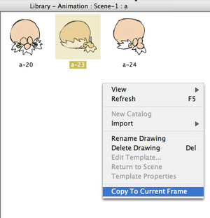
Here is a trick we use. Open the Library panel and navigate to Animation>Scene for your current scene and select the element you want to utilize. Then in the Library display window you can view all the cells for that element at once. Turn on the View>Thumbnails and you have a fast easy visual way to pick your desired cell. Then when you go to the Cells tab of the Properties window you just type in the cell number of that cell to place it on your desired frame or frame range in the time line. This works extremely well for elements which contain more than a few cells.


Or an even easier way is to use the copy to current frame context menu command directly from the Library display window. Select the desired frame in the time line, select the desired cell in the Library display window, right clicking to open that context menu and select copy to current frame.

So for things like swapping mouth positions you can use the Cells tab on the Properties panel, or for general selecting and placing of cells for reuse the Library panel may be even easier.

Labels: , , , , , ,

Tuesday, May 8, 2007

Using Pegs as Timeline Track Folders

This is the first in our Toon Boom Studio User Tips Series. These are just quick posts that highlight how to use a specific feature, or tool in TBS. Sometimes they will just hopefully clarify existing information and other times they may introduce a totally new way to take advantage of a TBS feature.

For anyone who has to deal with a large number of tracks in their timeline panel, I am sure you appreciate the addition of animated elements in TBS V3.5. With the addition of animated elements, which are drawing or image elements that contain their own wholly integrated peg element track, you can now greatly reduce the number of element tracks displayed in your timeline. In most cases, you no longer have to include a separate peg element track in order to keyframe animate your drawing or image elements. This is a great improvement in reducing clutter in your timeline panel.


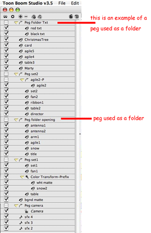
But even with this improvement, it can still be quite a challenge to manage all the element tracks that can end up populating a scene's timeline panel for a complex animation. So one of the tricks for reducing timeline track clutter is to use a concept similar to file folders. Anyone familiar with document management on Windows or Mac computers is use to organizing things inside file folders. So wouldn't it be great to have track folders as an organizational device to assist in grouping and hiding multiple timeline element tracks. "Great", you say, "but this is TBS and we don't have a timeline track folders feature". Well you are correct, we don't have a specific timeline track folder feature, but we do have those wonderful multipurpose elements called pegs. Now pegs are quite useful as containers for keyframed values and you also can use pegs to group elements together to create hierarchical templates, but there is even an additional way to utilize peg elements as timeline track folders. When you have a large number of element tracks in your timeline and you want to reduce your clutter just add a peg element track. Rename it to some meaningful name like "Peg Folder_1" or whatever makes sense in your scene. Then move this peg to a desired position in your timeline track label listing and attach those tracks,
which you want collected and organized together, to this "peg folder" . You aren't going to do any keyframing on this "peg folder" but you can expand or collapse it as needed to expose or hide the attached tracks and therefore you have tamed the clutter of track elements in your timeline label listing.


A few well thought out and placed "peg folders" can make working with a large number of tracks in your timeline much easier and faster and reduce the constant scrolling through all those tracks. Hope you find this a helpful tip.

Labels: , , , ,